Choosing paint, fabric, and finish colors is rarely about personal taste alone. It's about how hues interact with light, space, and each other, and that's exactly what color theory explains. Whether you're a homeowner in Ohio or a designer in London, the same underlying principles govern why a palette feels calm, energizing, or simply "off."
This guide breaks down the fundamentals of color theory, shows you how to build a palette step by step, and highlights the trends shaping interiors in the US and UK right now.
What Is Color Theory in Interior Design?
Color theory is a framework, originally developed for art and design, that explains how colors are created, how they relate to each other, and how they're perceived by the human eye. In interior design, it's applied practically: it tells you which wall color will make a small room feel larger, which accent will make a neutral sofa pop, and why certain combinations feel jarring rather than harmonious.
The Color Wheel Basics
Every interior palette starts with the same 12-color wheel:
- Primary colors, red, blue, yellow, cannot be mixed from other colors
- Secondary colors, green, orange, purple, created by mixing two primaries
- Tertiary colors, blends like red-orange or blue-green
Warm vs. Cool Colors
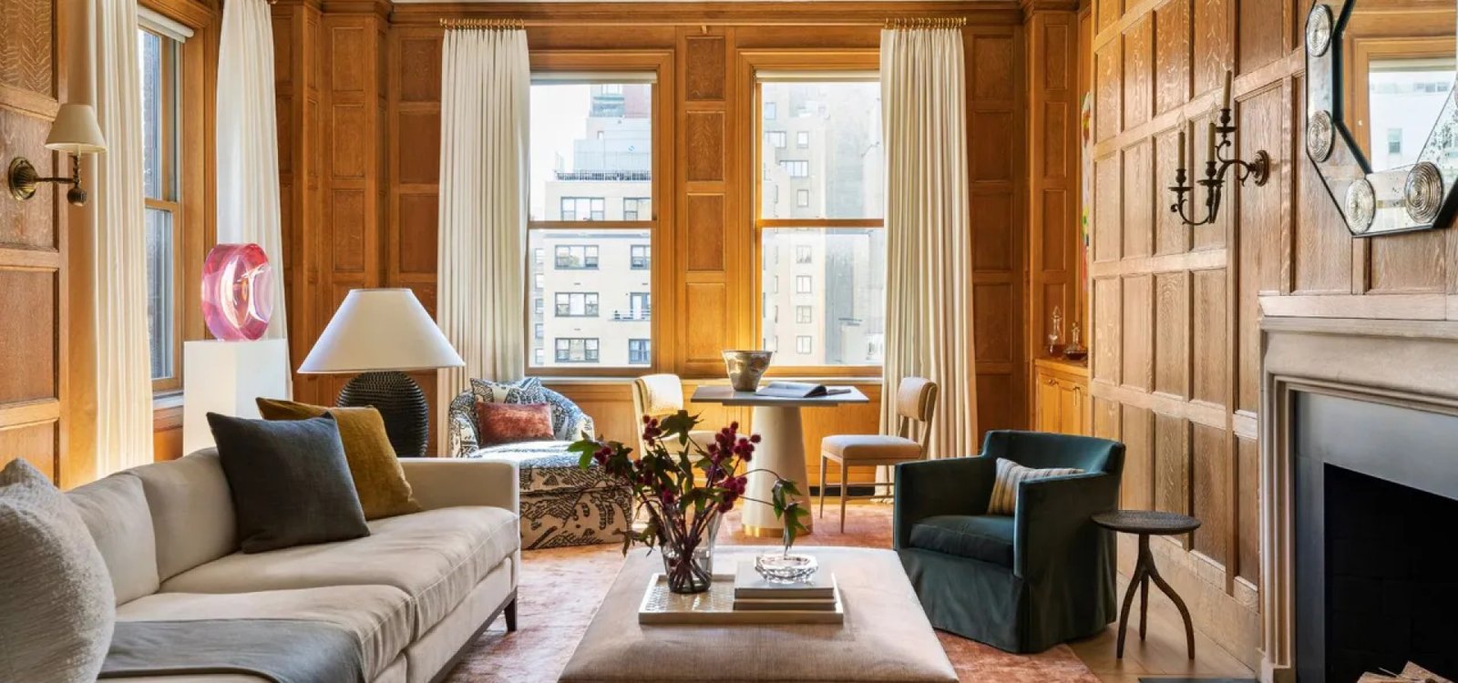
- Warm tones (reds, oranges, yellows) advance visually and make rooms feel cozier and smaller, ideal for living rooms and dining spaces
- Cool tones (blues, greens, violets) recede visually, making rooms feel calmer and more spacious, ideal for bedrooms and bathrooms
Expert Tip: If you're unsure whether a color reads warm or cool, hold the swatch next to a true white. Undertones that clash or clarify become obvious almost instantly.
The Main Color Schemes Designers Use
| Scheme | Definition | Best For |
|---|---|---|
| Monochromatic | Different shades/tints of one hue | Minimalist, calm interiors |
| Analogous | Colors next to each other on the wheel | Cohesive, low-contrast rooms |
| Complementary | Colors opposite each other on the wheel | Bold accent walls, energizing spaces |
| Triadic | Three evenly spaced colors on the wheel | Playful, balanced spaces (kids' rooms, creative studios) |
| Neutral | Beige, gray, white, taupe as a base | Flexible backdrops for any style |
How to Build a Room Palette: Step-by-Step
- Start with inspiration, pull from a rug, artwork, or fabric you already love, this anchors the palette in something tangible
- Pick a dominant color (60%), usually walls, large furniture, or flooring
- Choose a secondary color (30%), often upholstery, curtains, or a feature wall
- Add an accent color (10%), cushions, art, or accessories, this is where bolder choices work well
- Test in natural and artificial light, colors shift dramatically between morning sun, overcast daylight, and warm bulb lighting
- Check undertones, a "white" paint can read pink, green, or blue depending on its base, always test a swatch on the actual wall
Real-World Example
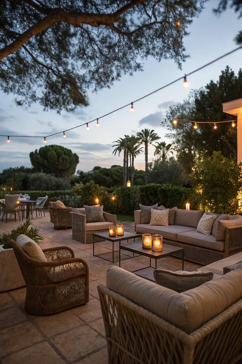
A London flat with limited natural light used a warm greige (dominant) paired with deep forest green cabinetry (secondary) and brass and terracotta accents (10%). The result: a small room that reads warm and layered rather than dark and flat, a textbook analogous scheme built around earthy neutrals.
US vs UK Color Preferences: What's Different?
While color theory itself is universal, regional preferences diverge:
- US interiors often lean toward warmer, nature-inspired neutrals, wheat, caramel, terracotta, and warm greige are especially popular in 2026, replacing the cooler grays that dominated the last decade
- UK interiors tend to favor deeper, more traditional tones, heritage greens, aubergine, and warm charcoal, reflecting a preference for period-appropriate palettes in older housing stock
- Both markets are converging on "warm minimalism", uncluttered layouts softened with organic textures, biophilic colors, and tactile materials rather than stark white minimalism
Did You Know: Designers surveyed by Luxe Interiors + Design point to warm greige and terracotta as the neutrals replacing cool gray across US homes this year, a clear reversal from the last decade's minimalist palette.
Current Color Trends in Interior Design (2026 Update)
Three Current Trends in Interior Color Schemes
- Grounded, earthy neutrals, clay, oxblood, caramel, and warm taupe replacing cool gray
- Deep, jewel-inspired accents, teal, burnt umber, and mineral tones used as statement colors
- Layered palettes, mixing bold, saturated hues with soft pastels and ethereal neutrals for dimension rather than flat, single-tone rooms
What Type of Color Dominates Modern Interior Design?
Modern interiors currently favor warm, nature-derived hues over the cool grays and stark whites that defined the 2010s minimalist era. Color forecasters, including Benjamin Moore and PPG, point to grounded reds, umber, and complex greens and blues as leading 2026 directions.
A Note on Past Trends (2019–2020)
If you're researching historical palettes: 2019 favored classic neutrals like navy, sage green, and warm terracotta as accent colors against white or greige backdrops. 2020 saw a shift toward calming, muted tones, dusty blues, soft greens, and warm grays, driven partly by increased time spent at home. These laid the groundwork for today's warmer, more textured palettes.
Pros and Cons of Bold vs. Neutral Palettes
| Approach | Pros | Cons |
|---|---|---|
| Bold palette | Memorable, expressive, great for feature walls | Can feel dated faster; harder to resell a home |
| Neutral palette | Timeless, easy to update accessories around | Can feel flat without texture and layering |
Final Thoughts
Good interior color choices aren't guesswork, they follow the same principles artists have used for centuries, adapted to how we actually live in our homes today.
Start with a scheme that matches your room's function, apply the 60-30-10 rule, and always test in real light before you commit, whether you're chasing 2026's warm, earthy palettes or building a timeless neutral base.
Frequently Asked Questions
What are three current trends in interior color schemes?
Grounded earthy neutrals (clay, caramel, taupe), deep jewel-toned accents (teal, umber), and layered palettes that mix bold and soft tones for depth.
What are the current trends for interior home paint colors?
Warm, nature-inspired neutrals, wheat, terracotta, and warm greige, are replacing the cool grays popular over the last decade, paired with richer accent colors like clay and deep green.
What are the hot home color trends these days?
Warm minimalism is leading: soft, breathable neutrals combined with organic textures and occasional bold jewel-tone accents like teal or burnt umber.
What type of color is used in modern interior design?
Modern interiors lean toward warm, grounded, nature-derived hues rather than the stark whites and cool grays typical of earlier minimalist trends.
What is the most popular color for home decor in 2019?
Navy, sage green, and warm terracotta were the standout choices in 2019, typically used as accent colors against white or greige backdrops rather than as dominant wall colors.
What are the trendy colors to paint a room in 2020?
2020 shifted toward calming, muted tones, dusty blues, soft sage greens, and warm grays, reflecting the increased time people spent at home that year.